
# 浮动
float属性定义元素在哪个方向浮动,任何元素都可以浮动
| 值 | 描述 |
|---|---|
| left | 元素向左浮动 |
| right | 元素向右浮动 |
浮动的原理:
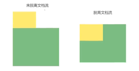
浮动以后使元素脱离了文档流,形成两层,出现压盖现象
浮动只有左右浮动,没有上下浮动
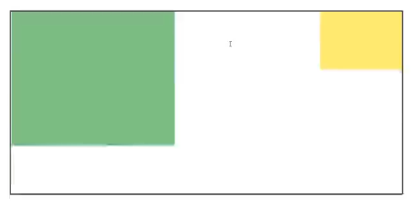
# 元素向左浮动
脱离文档流之后,元素相当于在页面上面增加了一个浮层来放置内容。此时可以理解为有两层页面,一层是底层的原页面,一层是脱离文档流的上层页面,所以会出现折叠现象
<div class="box"></div>
<div class="container"></div>
2
.container{
    width: 200px;
    height: 200px;
    background-color: green;
}

.box{
    width: 100px;
    height: 100px;
    background-color: yellow;
    float: left;
}
2
3
4
5
6
7
8
9
10
11
12
# 元素向右浮动
<div class="box"></div>
<div class="container"></div>
2
.container{
    width: 200px;
    height: 200px;
    background-color: green;
}

.box{
    width: 100px;
    height: 100px;
    background-color: yellow;
    float: right;
}
2
3
4
5
6
7
8
9
10
11
12
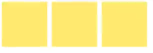
# 所有元素向左浮动
当所有元素同时浮动的时候,会变成水平摆放,向左或者向右
<div class="box"></div>
<div class="box"></div>
<div class="box"></div>
2
3
.box{
    width: 100px;
    height: 100px;
    background-color: yellow;
    float: left;
    margin: 0 5px;
}
2
3
4
5
6
7
应用场景如网页的横向导航栏,如(可尝试运行下面的例子):
ul li{
    float: left;
    margin: 0 10px; /*设置导航之间的间距*/
}
2
3
4
<ul>
    <li><a href="#">导航1</a></li>
    <li><a href="#">导航2</a></li>
    <li><a href="#">导航3</a></li>
    <li><a href="#">导航4</a></li>
</ul>
2
3
4
5
6
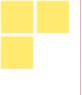
当容器不足时
当容器不足以横向摆放内容的时候,会在下一行摆放
<div class="container">
    <div class="box"></div>
	<div class="box"></div>
	<div class="box"></div>
</div>
2
3
4
5
.container{
    width: 200px;
    height: 200px;
    background-color: green;
    border: 1px solid red;
}

.box{
    width: 100px;
    height: 100px;
    background-color: yellow;
    float: left;
    margin: 5px;
}
2
3
4
5
6
7
8
9
10
11
12
13
14
# 清除浮动
浮动的副作用:
当元素设置float浮动后,该元素就会脱离文档流并向左 / 向右浮动
- 浮动元素会造成父元素高度塌陷。即当子元素设置
float: left;且父元素未设置宽高时,父元素就会高度塌陷(高度为0),显示不出来 - 后续元素会受到影响。例:当后续元素与设置了浮动的子元素的父元素同级,则该后续元素应当显示在父级元素后,但是由于现在父级元素不可见,所以显示在浮动子元素下面,就被遮挡了
如(以下代码可以呈现上述问题):
.container {
    background-color: #888;
}
.box {
    width: 100px;
    height: 100px;
    background-color: aqua;
    margin: 5px;
    float: left;
}
.test1 {
    width: 100px;
    height: 100px;
    background-color: blueviolet;
}
.test2 {
    width: 100px;
    height: 100px;
    background-color: blue;
}
2
3
4
5
6
7
8
9
10
11
12
13
14
15
16
17
18
19
20
<div class="container">
    <div class="box"></div>
    <div class="box"></div>
    <div class="box"></div>
    <div class="test1"></div>
</div>
<div class="test2"></div>
2
3
4
5
6
7
清除浮动:
当父元素出现塌陷的时候,对布局是不利的,所以我们必须清除副作用
解决方案有很多种
父元素设置高度
受影响的元素添加clear属性
在父元素中用overflow清除浮动
伪对象方式
父元素设置高度
如果父元素高度塌陷,可以给父元素设置高度,撑开元素本身大小
例(只需要改变上述问题代码的父元素):
.container {
    width: 400px;
    height: 400px;
    background-color: #888;
}
1
2
3
4
5但是此时虽然test2排列在了父元素后面,但是test1仍然被遮挡
受影响的元素添加clear属性
clear: left;删除左浮动,clear: right;删除右浮动,clear: both;都删除为了解决test1仍然被遮挡的问题,可以在test1中添加clear属性
.test1 {
    width: 100px;
    height: 100px;
    background-color: blueviolet;
    clear: both;
}
1
2
3
4
5
6overflow清除浮动
用的最多
如果父级塌陷,并且同级元素也受到了影响,可以使用
overflow清除浮动这种情况下,父布局不能设置高度
父级标签的样式里加:
overflow: hidden;clear: both;,缺一不可.container { background-color: #888; overflow: hidden; clear: both; }1
2
3
4
5伪对象方式
如果父级塌陷,并且同级元素也受到了影响,可以使用伪对象方式处理
为父标签添加伪类
after,设置空的内容,并且使用clear:both;这种情况下,父布局不能设置高度
.container {
    background-color: #888;
}
.container::after {
    content: "";
    overflow: hidden;
    clear: both;
}
1
2
3
4
5
6
7
8